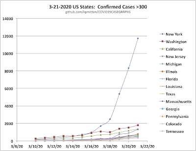
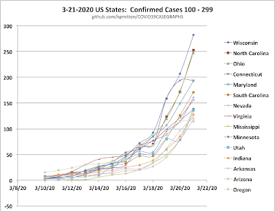
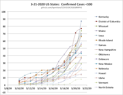
This post will be updated whenever I get time to pull the latest COVID-19 case data from github.com and do the sorting and graphing. Please use and share the graphs in the public domain. I use this data so I can analyze and predict for myself where cases are going to rise fastest.
You will note from 3-21-2020 data that New York state is going to be the first hardest hit. The list of States or Provinces in each graph legend is in order, top to bottom, from the relatively highest number of cases to lower.
On 3-21-2020 I started to add graphs for Canada and Australia.
These graphs in PDF format are now available for free use for public education and by journalists. Use, share, educate, write, with my blessing.
I have a repository of graphs set up at GitHub:
https://github.com/kpmitton/COVID19CASEGRAPHS
You will find graphs in folders named by day.
Ken Mitton, PhD
(http://TheScienceRant.com)


